Complete Instagram Post Size Guide
Instagram post size choices play a major role in how your content appears on the platform. Many creators face issues like blurry uploads, uneven cropping, or inconsistent quality without understanding the cause. Most of these problems come from using the wrong dimensions rather than weak visuals. When you follow the recommended sizes, your images look sharper, more professional, and more consistent across all devices.
Why Correct Size Matters
Using the correct size helps Instagram apply less compression and maintain clarity. When an image does not match the platform’s ideal ratios, the system forces it to fit and reduces quality in the process. This can soften details and create unwanted distortion. Accurate sizing also supports a cohesive and polished grid layout.
Before moving into specific dimensions, it is helpful to know that Instagram optimizes every file you upload. When you provide a file that already matches its expectations, the final result looks noticeably clearer, and this simple step leads to better engagement and more appealing visuals.
Quick Size Reference for All Instagram Formats
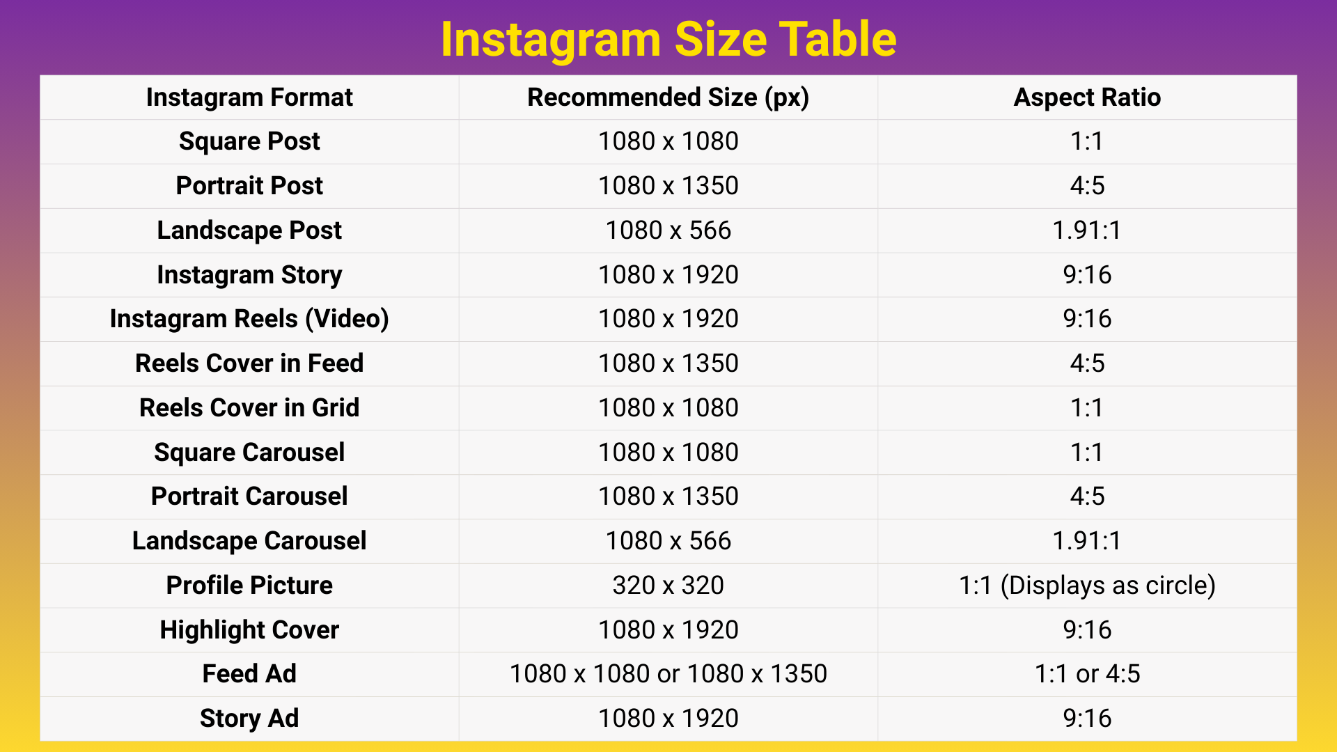
Use this quick reference to double-check the ideal sizes and aspect ratios for every major Instagram format. The table below outlines the recommended dimensions, helping you prepare clearer, sharper, and more consistent content across posts, Stories, Reels, and carousels.
Square Post Size
Square posts still stand as one of the cleanest and most reliable formats on Instagram. They fit neatly in the feed and work well for quotes, product photos, and anything requiring simple symmetry. This familiar layout also helps you maintain an organized grid. Creators who prefer minimal design often choose this format for its balance.
Recommended size: 1080 x 1080 px
Aspect ratio: 1:1
Before viewing the tips below, remember that square posts reduce the chance of accidental cropping. The equal sides create a natural center point that supports balanced composition.
This makes the square format especially beginner-friendly.
Tips for Square Images
These suggestions help your square posts stay clear and well structured. They support visual balance and make your message easier to read.
They are also useful for maintaining a consistent style within your grid.
- Keep your main subject centered
- Add generous padding around text or graphics
- Use clean backgrounds for a stronger look
- Keep the design simple for clarity
These practices prevent clutter and keep attention on the intended focus. Square images often look best when kept minimal.
Over time, this leads to a cleaner and more recognizable visual identity.
Portrait Post Size
Portrait posts use more vertical space and naturally pull the viewer’s eye downward. Because they take up more of the screen, they usually perform better in terms of reach and engagement. This layout suits lifestyle, fashion, and product-based content very well. Vertical framing also enhances storytelling visually.
The portrait ratio aligns with natural mobile scrolling behavior. It offers the viewer more content before they swipe away.
This often leads to stronger retention and higher interaction.
Recommended size: 1080 x 1350 px
Aspect ratio: 4:5
This dimension gives your visuals room to breathe without feeling oversized. It helps highlight textures, outfits, and tall subjects.
Creators who want to maximize visibility often prefer portrait posts.
Best Use Cases for Portrait
The examples below show where portrait posts truly shine. These scenarios benefit most from the extra vertical space.
They can guide you when choosing the ideal orientation for your next upload.
- Fashion, lifestyle and travel content
- Product photography
- Reels cover photos
- Vertical storytelling sequences
When used in these categories, portrait posts create depth and presence. They help audiences notice details that square formats sometimes hide.
This leads to a stronger visual impact overall.
Landscape Post Size
Landscape posts offer a cinematic feel and suit scenic visuals, architecture, and wide compositions. While they appear smaller in the feed, they deliver beautiful horizontal balance. This format is ideal for images that rely on depth and width.
Landscape orientation also adds variety to your grid. It breaks the repetition of vertical formats and creates breathing room for the viewer.
This balance brings visual diversity to your profile.
Recommended size: 1080 x 566 px
Aspect ratio: 1.91:1
This ratio prevents stretching and preserves the integrity of wide shots. It keeps your compositions natural and easy to follow. When used correctly, landscape posts look elegant and intentional.
Tips for Landscape Layouts
Landscape posts benefit from thoughtful composition because they display smaller in the feed. The tips below help maintain clarity and balance within the wide frame.
They also ensure that key details remain visible on all screens.
- Keep the horizon straight
- Avoid thin text that becomes unreadable
- Place important subjects near the center
- Use strong contrast for clarity
These tips protect your image from looking flat or unclear. Proper balance keeps the visual appealing even at a reduced size.
Landscape posts can add refinement and cinematic energy to your content mix.
Carousel Post Size
Carousel posts allow you to share multistep explanations, educational content, or storytelling sequences. Consistency across all slides is essential for a professional look. When your dimensions match, swiping becomes smoother for the viewer.
Carousels help audiences engage longer with your content. They encourage swiping and interaction while offering more space for concepts.
This makes them one of the strongest formats for in-depth communication.
Recommended size: Same size across all slides
Common choice: 1080 x 1350 px
Uniform sizing keeps your layout structured and helps deliver ideas more clearly. Carousels support both photos and design-heavy slides well.
This stability makes the format an excellent choice for guides and educational content.
How to Build a Better Carousel
The tips below help your carousel feel polished and cohesive. They guide the viewer through your information naturally.
They also support cleaner storytelling with less visual clutter.
- Use a strong hook on the first slide
- Keep text away from edges
- Maintain consistent style and spacing
- End with a clear message or conclusion
These steps make the viewer experience smoother and improve comprehension. A strong final slide leaves a lasting impression.
Well-structured carousels are more likely to be saved and shared.
Instagram Stories Size
Instagram Stories fill the entire screen vertically, offering a dynamic way to communicate. Using incorrect dimensions leads to stretching, border gaps, or cropped areas. To maintain a clean look, use the platform’s preferred ratio.
Stories also support quick updates, links, polls, and behind-the-scenes content. Their full-screen structure creates a more intimate viewing experience. This makes clarity and layout especially important.
Recommended size: 1080 x 1920 px
Aspect ratio: 9:16
This size fits perfectly across smartphone screens. It ensures your visuals display as intended without distortion. Using the right ratio helps create a polished and immersive Story experience.
Story Design Tips
These suggestions help prevent layout issues caused by UI elements or screen variations. They keep your content readable and centered.
They also improve viewer comfort by ensuring clean spacing.
- Position text near the center
- Avoid placing important details at the top or bottom
- Use high-resolution files
- Keep animations simple
Following these guidelines improves both readability and aesthetic quality. Balanced spacing makes your Stories more enjoyable to watch. This leads to better retention and more positive engagement.
Reels Size
Reels share the same video ratio as Stories but require special attention for cover images. The cover appears differently in the feed and in your profile grid. Planning for these variations protects your composition and prevents awkward cropping.
Reels are one of the strongest tools for discovery on Instagram. Their dynamic nature supports fast content consumption, and well-designed Reels enhance visibility and viewer engagement.
Reels video size: 1080 x 1920 px
Reels cover size in feed: 1080 x 1350 px
Grid crop: 1:1
Because of these variations, centered design is crucial. A well-balanced cover adapts smoothly in all placements. This helps maintain brand consistency and professional quality.
Reels Layout Tips
These ideas help your Reels appear sharper and more structured. They support both visual clarity and better viewer retention.
They also help your covers remain effective across different placements.
- Center the main content
- Keep text within safe zones
- Use consistent cover styles
- Start videos with strong visuals
Applying these tips makes your Reels more compelling and memorable. Consistent covers improve brand recognition.
Strong opening visuals help capture attention quickly.
Frequently Asked Questions
What is the ideal Instagram post size?
The portrait size of 1080 x 1350 px usually gives the best engagement.
Why do my Instagram photos look blurry?
Your files may be too small or saved in the wrong color profile. Use sRGB and 1080 px width.
Can I mix sizes in a carousel?
You can, but using one consistent size looks cleaner and more professional.
What is the ideal Instagram Story size?
The correct size is 1080 x 1920 px with a 9:16 ratio.
Why is my Reel cover cropped?
It appears at 4:5 in the feed but gets cropped to 1:1 in your profile grid.
Do I need professional software to create correct Instagram sizes?
No. Any tool that exports at the right ratio and resolution will work.