Facebook Post Size Guide for Better Reach
Facebook post size means the image and video dimensions you use in a post so it displays clearly, avoids awkward cropping, and stays sharp after Facebook compresses it.
If you have ever posted a design that looked perfect in your editor but ended up blurry, zoomed-in, or chopped at the edges, you have met the real problem. Facebook shows the same post in different layouts across mobile, desktop, and placements. That mismatch is where reach quietly slips away. People scroll past content that looks messy, hard to read, or poorly framed. This guide helps you stop guessing. You will learn the most reliable post sizes, how to design for real-world cropping, and how to build a simple workflow that keeps your content consistent.
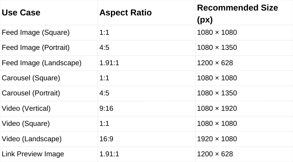
Post Size Cheat Sheet (Quick Table)
If you want a fast answer, start here. These sizes cover the most common Facebook post formats and help your content stay sharp without awkward cropping.
Why Post Size Affects Reach
Reach is not only about what you say. It is also about how quickly your content communicates. If a post looks fuzzy or cramped, people do not pause. Low pause time often means fewer reactions, fewer comments, and fewer shares.
Correct sizing helps in three practical ways:
- Your visuals stay crisp after compression.
- Your focal point stays visible instead of getting clipped.
- Your text remains readable on phones.
You do not need perfect specs to win. You need dependable formats and smart sharing habits.
Best Image Sizes for Feed Posts
For most brands, the feed is where consistency matters most. These three formats cover the majority of use cases and behave well on Facebook.
- Square (1:1): 1080 × 1080
- Portrait (4:5): 1080 × 1350
- Landscape (1.91:1): 1200 × 628
Square is the safest if you want one design that rarely surprises you. Portrait 4:5 often earns more attention on mobile because it takes more vertical space. Landscape is useful for wide photos or link-style visuals, but it can look smaller in the feed.
If you want a single default for images, 1080 × 1350 is a strong choice. It gives you presence without forcing extreme vertical design.
Best Video Sizes for Facebook Posts
A Facebook video can appear on several surfaces. Your safest move is to pick a primary video format based on your content style.
- Vertical (9:16): 1080 × 1920
- Square (1:1): 1080 × 1080
- Landscape (16:9): 1920 × 1080
Vertical works best for mobile-first storytelling and short-form clips. Square is a flexible middle ground if you publish across platforms. Landscape still works well for interviews, webinars, and screen-based content.
For better reach, your first seconds matter more than your resolution and your live shows too. Still, correct sizing prevents the “this looks off” moment that makes people scroll away.
How Facebook Crops and Compresses Media
Most sizing issues come from two behaviors: cropping and compression.
Cropping happens because Facebook tries to fit your media into different frames. Compression happens because Facebook reduces file size to load faster. You cannot control those systems, but you can design for them.
Here is the most useful mindset: design for the center, not the edges. Place your key elements where they survive most crops.
A Practical Safe Zone Rule
Use this rule for both images and video:
- Keep faces, logos, and key text in the middle 60 to 70 percent.
- Leave extra breathing room at the top and bottom for vertical formats.
- Avoid putting important details in the corners.
This is the easiest way to reduce “Why did it cut off my headline?” stress.
Carousel Post Sizing That Stays Consistent
Carousels are powerful for reach because they invite swipes. They can also look messy if slide sizes are inconsistent.
To keep carousels clean:
- Use one aspect ratio across every slide.
- Export all slides at the same pixel dimensions.
- Avoid mixing square and portrait in one set.
Great options for carousels are
- 1080 × 1080 for universal consistency
- 1080 × 1350 if you want more reading space
Pick one and make it your standard. Consistency here often beats creativity.
Link Post Images and Preview Sizing
When you share a link, Facebook generates a preview that depends on the page metadata. If the preview image is the wrong ratio, it can crop in an unflattering way.
A widely compatible link preview format is
- 1200 × 628 (1.91:1)
If you control the website, set a strong preview image that is large, clear, and readable at small sizes. If you do not control it, consider posting as an image post with the link in the caption, if that fits your strategy.
Common Facebook Post Size Mistakes to Avoid
These mistakes are easy to fix once you know them:
- Designing at small sizes and scaling up later.
- Using mixed aspect ratios in a carousel.
- Placing subtitles too low in vertical video.
- Posting screenshots with tiny, unreadable text.
- Exporting with heavy compression and then uploading.
Most reach problems are not dramatic. They are small friction points that make people scroll.
FAQs
Why are my Facebook images blurry?
Facebook compresses uploads. Blurriness can also come from low-resolution exports or heavy pre-compression. Export higher quality and avoid tiny source files.
How do I prevent Facebook from cropping my posts?
Keep key elements centered, leave padding near edges, and avoid placing text at the very top or bottom of vertical designs.
Does Facebook reduce image quality after upload?
Yes. Facebook compresses images and videos, so start with high-resolution files and avoid heavy compression before uploading to keep posts sharp.